FLYE App
FLYE’s first mobile app designed to unify its fragmented, offline-heavy services into a single, customer-centric digital platform.This case study focuses on the rental module as a representative example of how complex, real-world service operations were translated into scalable digital workflows.
Time
Design & Launch: Aug - Dec 2025
My Role
Design & Product Lead:
Led the end-to-end mobile app lifecycle—from problem definition and service mapping to UX/UI design and launch—working at the intersection of product strategy, operations, and design.
Cross-functional Collaboration
CEO
Marketing
Operation
Legal
Development Team


[ Business Context ]
As FLYE prepared for post-IPO global expansion, the company faced a structural gap: While its business operated across sales, rentals, repairs, and financing, there was no unified digital system to support customers or internal teams at scale.
[ Core Problem ]
Key services relied heavily on in-store interactions, manual processes, or third-party tools. As a result, customer experiences varied widely across locations, internal teams lacked shared visibility, and the brand became fragmented across touchpoints—making scalable expansion difficult.
[ Outcome ]
I led the end-to-end design of FLYE’s first mobile app, from defining the product vision and information architecture to designing service workflows and core user experiences.
The app unified previously fragmented services into a cohesive system, improved customer access, reinforced the brand, and established standardized digital flows for operations across stores.
[ Challenges ]
Designing FLYE’s first-ever mobile app came with a unique set of challenges.
1.Balancing multi-stakeholder needs within a single system
Designing a shared product system that had to simultaneously serve customers, store staff, operations, finance, and leadership—requiring clear prioritization, explicit trade-offs, and a system that could make those decisions visible and scalable.
2.Designing with incomplete data and evolving requirements
Designing core product flows while business rules, pricing models, and operational policies were still evolving—requiring flexible architectures, assumption-driven decisions, and designs that could adapt without constant rework.
3.Driving alignment in a sales-led organization
Initiating and advocating for a long-term product vision within a team historically focused on offline sales and short-term execution—requiring strong storytelling, cross-functional communication, and the ability to align design decisions with business outcomes.
[ Design Process ]
A pragmatic design approach shaped by scope and team constraints

In the following section, the Rental module is presented as the first and foundational release, illustrating how this approach translated a high-complexity service into a scalable digital workflow.
[ Design Goals ]
Balancing Multi-Stakeholder Values in a Shared System
Operational Efficiency
-
Standardize rental workflows across multiple stores
-
Reduce time spent by store managers and staff on explaining plans and tracking payments
-
Enable teams to focus more on customer service rather than administrative tasks
Financial Reliability at Scale
-
Digitize payment records to ensure accurate, traceable transactions
-
Simplify reconciliation through systemized transaction flows, reducing manual workload for finance teams
Organizational Visibility
-
Provide leadership and internal teams with a shared view of rental activity and customer status
-
Enable monitoring of core KPIs to support performance tracking and strategic decision-making
Brand Consistency
-
Ensure unified branding and a consistent brand experience across all customer touchpoints
[ Prototypes ]
Prototyping as a Tool for Alignment
With no existing digital foundation and highly diverse stakeholder needs, documentation alone was insufficient. I used prototypes at different levels of fidelity to align stakeholders around value, constraints, and trade-offs.
Finance Teams → Accuracy & Traceability
-
Early admin platform prototypes
-
Payment records, period details, reconciliation views

Operations Teams → Process & Exception Handling
-
User flow diagrams
-
Key app interfaces defining real-world workflows

CEO & Leadership → Vision & Scale
-
Leadership Dashboard Prototype
-
Mid-Fidelity Prototypes of All Core App Modules


[ Iteration ]
Iteration as Validation & Refinement
Prior to MVP handoff, iteration followed a structured loop of interactive prototyping, user testing, synthesis, and feasibility review.

Iteration Criteria 1
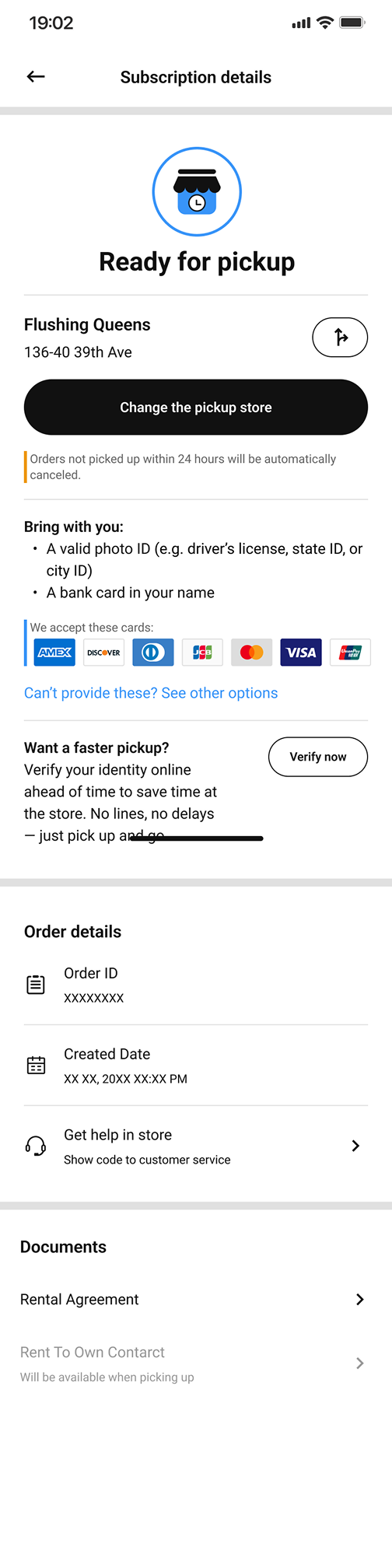
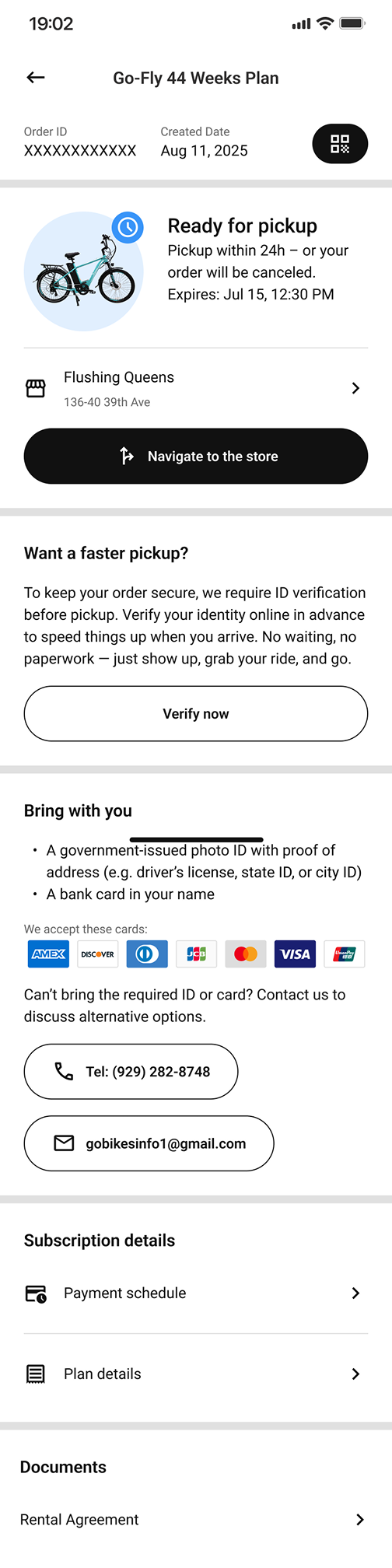
Example 1: Rent-to-Own Order Status Page
Goals:
-
Make the next required action unmistakable for users preparing for in-store pickup.
-
Encourage users to verify their identity in advance to save time.
-
Consolidate essential order details into a single, easy-to-scan view.

Iteration 1
• Order-related information was insufficient and scattered.
• 3/3 testers failed to identify the next step without guidance.
Insight: Users lacked a clear mental model of where they were in the process and what action was required.
Iteration 2

• 1/3 testers still failed to identify the next step.
• 3/3 testers ignored the verification prompt.
• Lack of a unique order identifier caused confusion when referencing the order.
Insight: Improving visibility alone was not enough—users needed explicit action-oriented guidance.
Iteration 3

• 2/3 testers still hesitated on the next step.
• 1/3 testers continued to overlook verification when it was presented as secondary content.
Insight: When multiple pieces of information competed for attention, users defaulted to status-checking rather than task completion.

Iteration 4

• 5/5 testers correctly identified the next step.
• 4/5 testers mentioned ID verification unprompted when asked what to prepare before pickup.
Outcome: Users were able to prepare for in-store pickup independently, without staff assistance—clearly understanding what to do next, where to go, and what to bring.
Example 2: Rent-to-Own Plan List Page
Goals:
-
Enable users to quickly browse available Rent-to-Own plans in their city.
-
Make pricing and plan duration transparent at a glance.
-
Support different user intents—both exploration and immediate conversion.


Iteration 1
• The plan list lacked clear visual hierarchy, making it difficult to scan and compare options.
• Users who wanted to learn more before committing were confused by a single, conversion-heavy CTA.
• Pricing details (weekly cost, deposit, taxes) were not immediately legible, increasing hesitation.
Insight: Treating all users as “ready to rent” ignored exploratory behavior and created unnecessary friction.


Iteration 2
• Users were able to distinguish plans more quickly and understand core differences at a glance.
• Exploratory users no longer felt forced into a decision and could progress at their own pace.
Insight: Supporting multiple user intentions increased clarity without sacrificing conversion readiness.
Example 3: Order Created Successfully Popup
Goals:
-
Clearly confirm that the order has been successfully created.
-
Guide users smoothly into the post-order flow without introducing hesitation or cognitive load.

Iteration 1

• 5/5 users hesitated to close the popup, fearing they might lose important information.
• The popup repeated content already shown on the order detail page, increasing cognitive load.
• Dense instructional text blurred the distinction between confirmation and next-step guidance.
Insight: A confirmation state should reassure and redirect—not require users to read or decide.

Iteration 2

• 3/3 Users felt confident closing the popup without fear of missing information.
• The transition from order creation to order management became smooth and intuitive.
• The confirmation moment reinforced system trust rather than interrupting the flow.
Insight:In post-action states, clarity and restraint are more effective than completeness.
-
Iteration Criteria 2
Example1: Rent-to-Own Order Status Page
Goal:
Provide users with all plan-related information—including pricing, payments, items, specifications, and warranty details—without increasing cognitive load or structural complexity.

Iteration 1

The page experience was clear, but the underlying structure was unnecessarily complex:
• “What’s Included” listed the items bundled with the plan.
• “Specifications” presented detailed product parameters.
• While understandable to users, the two sections overlapped conceptually and increased content fragmentation.
Insight: Separate sections improved clarity superficially, but introduced redundant data structures and additional maintenance overhead.

Iteration 2

• Users continued to access all relevant plan details without confusion or loss of clarity.
• The page became easier to maintain, update, and scale as product configurations evolved.
• Future content changes required fewer structural decisions and less coordination across systems.
Insight: Structural simplicity can often be achieved without altering perceived user experience.
Iteration Criteria 3
Example: Verification-Upload Photo ID
Goal:
Help users complete the photo ID upload step in the identity verification process, even when their situation does not match the predefined options.


Iteration 1
• Order-related information was insufficient and scattered.
• 3/3 testers failed to identify the next step without guidance.
Insight: Users lacked a clear mental model of where they were in the process and what action was required.


Iteration 2
• 1/3 testers still failed to identify the next step.
• 3/3 testers ignored the verification prompt.
• Lack of a unique order identifier caused confusion when referencing the order.
Insight: Improving visibility alone was not enough—users needed explicit action-oriented guidance.


Iteration 3
• 2/3 testers still hesitated on the next step.
• 1/3 testers continued to overlook verification when it was presented as secondary content.
Insight: When multiple pieces of information competed for attention, users defaulted to status-checking rather than task completion.
Iteration Criteria 4
Example: Verification Progress Bar

Iteration 1
• The design required multiple unique components, increasing development complexity.
• Maintaining visual consistency across different screen sizes is difficult.

Iteration 2
• The progress indicator became easier to implement and maintain.
• Development workload was reduced without sacrificing user comprehension.
• The component scaled more reliably across screen sizes and future verification flows.
Iteration Criteria 5
Example: Display of Time Format
Goal:
Present time and date information clearly and consistently across different locations and languages.

Iteration 1
• Time was displayed in a language-dependent format (e.g. “10:00 PM on Aug 11, 2025”).
• Each language required its own date and time structure.
• Localization rules varied significantly across regions, increasing implementation complexity and maintenance cost.


Iteration 2
• Time information became predictable and consistent across regions.
• Localization effort for developers was significantly reduced.
• The system became easier to extend to additional markets and future features involving time-based data.
[ Final Outcome ]
The final designs of the APP were delivered as a structured, development-ready MVP, with clear flows, defined edge cases, and reusable components.

The admin dashboard was assembled using existing open-source design components based on the data schema and annotated app designs, and refined through an implementation-driven iteration process directly on the working build.
[ Design Principles ]
Design Principles Reinforced Through This Project
Continuous Stakeholder Alignment Prevents Costly Pivots
In cross-functional environments with divergent priorities, alignment cannot be deferred or assumed. Regular check-ins supported by shared artifacts—such as prototypes, flows, and visual mockups—help surface trade-offs early, keep teams aligned on priorities, and prevent late-stage redesigns that can derail timelines.
Visual Artifacts Drive Stronger Buy-In Than Text Alone
When communicating design decisions and requirements, visual storytelling consistently proved more effective than text-heavy documentation. Wireframes, prototypes, and visual mockups significantly improved comprehension and buy-in by making abstract requirements tangible and bridging gaps between technical constraints and business objectives.
Process Efficiency: Figma Auto Layout is a time saver!
While I knew design components save time before, this project showed me Auto Layout is equally important. When designing for multi-language support, text lengths varied dramatically across languages. Auto Layout automatically adjusted spacing and alignment without manual repositioning for each variant, saving hours of work. This freed up time to focus on actual user experience decisions.
Process Efficiency Enables Better Design Decisions
Efficiency in execution directly impacts the quality of design thinking. Leveraging Figma Auto Layout early—especially in a multi-language context where text length varied significantly—reduced manual rework and ensured consistent spacing and alignment. This freed up time and focus for higher-impact user experience decisions rather than repetitive layout adjustments.
Clear UX Writing Is a Core System Component
UX writing is not a layer applied at the end, but a structural part of the system. Investing time in crafting clear, concise, and context-aware microcopy reduced cognitive load, clarified next steps, and measurably improved task completion during usability testing—particularly in flows that previously relied on in-store explanations.
Strategic Focus Outperforms Perfectionism
Not every design detail carries equal weight. Actively distinguishing between high-impact elements and “nice-to-have” refinements enabled more effective prioritization of time and effort. By concentrating on core user flows and key interaction points, the final solution achieved stronger overall outcomes without unnecessary complexity.
System-Level Thinking Is Essential in Scalable Products
In a multi-module system, no change exists in isolation. Even small adjustments required structured impact checks across related pages, flows, and touchpoints. Treating the product as an interconnected system ensured that updates strengthened overall coherence rather than introducing inconsistencies or fragmentation.
